Example Data Analysis in a Jupyter Notebook
Now we’ve looked at what a Jupyter Notebook is, it’s time to look at how they’re used in practice, which should give you a clearer understanding of why they are so popular. It’s finally time to get started with that Fortune 500 data set mentioned earlier. Remember, our goal is to find out how the profits of the largest companies in the US changed historically.
It’s worth noting that everyone will develop their own preferences and style, but the general principles still apply, and you can follow along with this section in your own notebook if you wish, which gives you the scope to play around.
Before you start writing your project, you’ll probably want to give it a meaningful name. Perhaps somewhat confusingly, you cannot name or rename your notebooks from the notebook app itself, but must use either the dashboard or your file browser to rename the .ipynb file. We’ll head back to the dashboard to rename the file you created earlier, which will have the default notebook file name Untitled.ipynb.
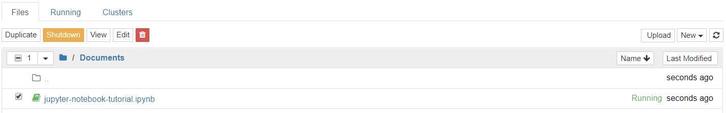
You cannot rename a notebook while it is running, so you’ve first got to shut it down. The easiest way to do this is to select “File > Close and Halt” from the notebook menu. However, you can also shutdown the kernel either by going to “Kernel > Shutdown” from within the notebook app or by selecting the notebook in the dashboard and clicking “Shutdown” (see image below).
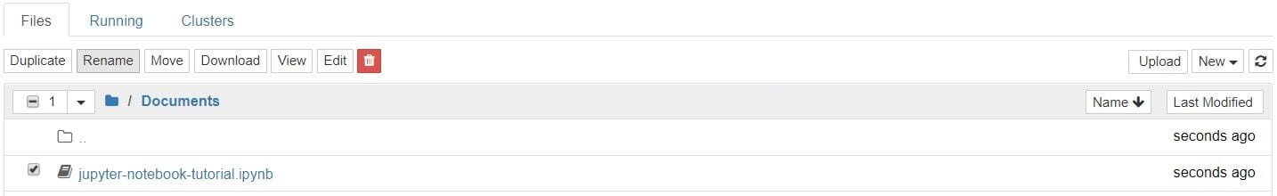
You can then select your notebook and and click “Rename” in the dashboard controls.
Note that closing the notebook tab in your browser will not “close” your notebook in the way closing a document in a traditional application will. The notebook’s kernel will continue to run in the background and needs to be shut down before it is truly “closed” — though this is pretty handy if you accidentally close your tab or browser! If the kernel is shut down, you can close the tab without worrying about whether it is still running or not.
Once you’ve named your notebook, open it back up and we’ll get going.
It’s common to start off with a code cell specifically for imports and setup, so that if you choose to add or change anything, you can simply edit and re-run the cell without causing any side-effects.
import pandas as pdimport matplotlib.pyplot as pltimport seaborn as snssns.set(style="darkgrid")
We import pandas to work with our data, Matplotlib to plot charts, and Seaborn to make our charts prettier. It’s also common to import NumPy but in this case, although we use it via pandas, we don’t need to explicitly. And that first line isn’t a Python command, but uses something called a line magic to instruct Jupyter to capture Matplotlib plots and render them in the cell output; this is one of a range of advanced features that are out of the scope of this article.
Let’s go ahead and load our data.
df = pd.read_csv('fortune500.csv')
It’s sensible to also do this in a single cell in case we need to reload it at any point.
Now we’ve got started, it’s best practice to save regularly. Pressing Ctrl + S will save your notebook by calling the “Save and Checkpoint” command, but what this checkpoint thing?
Every time you create a new notebook, a checkpoint file is created as well as your notebook file; it will be located within a hidden subdirectory of your save location called .ipynb_checkpoints and is also a .ipynb file. By default, Jupyter will autosave your notebook every 120 seconds to this checkpoint file without altering your primary notebook file. When you “Save and Checkpoint,” both the notebook and checkpoint files are updated. Hence, the checkpoint enables you to recover your unsaved work in the event of an unexpected issue. You can revert to the checkpoint from the menu via “File > Revert to Checkpoint.”
Now we’re really rolling! Our notebook is safely saved and we’ve loaded our data set df into the most-used pandas data structure, which is called a DataFrame and basically looks like a table. What does ours look like?
df.head()
| Year | Rank | Company | Revenue (in millions) | Profit (in millions) |
0 | 1955 | 1 | General Motors | 9823.5 | 806 |
1 | 1955 | 2 | Exxon Mobil | 5661.4 | 584.8 |
2 | 1955 | 3 | U.S. Steel | 3250.4 | 195.4 |
3 | 1955 | 4 | General Electric | 2959.1 | 212.6 |
4 | 1955 | 5 | Esmark | 2510.8 | 19.1 |
df.tail()
| Year | Rank | Company | Revenue (in millions) | Profit (in millions) |
25495 | 2005 | 496 | Wm. Wrigley Jr. | 3648.6 | 493 |
25496 | 2005 | 497 | Peabody Energy | 3631.6 | 175.4 |
25497 | 2005 | 498 | Wendy’s International | 3630.4 | 57.8 |
25498 | 2005 | 499 | Kindred Healthcare | 3616.6 | 70.6 |
25499 | 2005 | 500 | Cincinnati Financial | 3614.0 | 584 |
Looking good. We have the columns we need, and each row corresponds to a single company in a single year.
Let’s just rename those columns so we can refer to them later.
df.columns = ['year', 'rank', 'company', 'revenue', 'profit']
Next, we need to explore our data set. Is it complete? Did pandas read it as expected? Are any values missing?
len(df)
25500
Okay, that looks good — that’s 500 rows for every year from 1955 to 2005, inclusive.
Let’s check whether our data set has been imported as we would expect. A simple check is to see if the data types (or dtypes) have been correctly interpreted.
df.dtypes
year int64rank int64company objectrevenue float64profit objectdtype: object
Uh oh. It looks like there’s something wrong with the profits column — we would expect it to be a float64 like the revenue column. This indicates that it probably contains some non-integer values, so let’s take a look.
non_numberic_profits = df.profit.str.contains('[^0-9.-]')df.loc[non_numberic_profits].head()
| year | rank | company | revenue | profit |
228 | 1955 | 229 | Norton | 135.0 | N.A. |
290 | 1955 | 291 | Schlitz Brewing | 100.0 | N.A. |
294 | 1955 | 295 | Pacific Vegetable Oil | 97.9 | N.A. |
296 | 1955 | 297 | Liebmann Breweries | 96.0 | N.A. |
352 | 1955 | 353 | Minneapolis-Moline | 77.4 | N.A. |
Just as we suspected! Some of the values are strings, which have been used to indicate missing data. Are there any other values that have crept in?
set(df.profit[non_numberic_profits])
{'N.A.'}
That makes it easy to interpret, but what should we do? Well, that depends how many values are missing.
len(df.profit[non_numberic_profits])
369
It’s a small fraction of our data set, though not completely inconsequential as it is still around 1.5%. If rows containing N.A. are, roughly, uniformly distributed over the years, the easiest solution would just be to remove them. So let’s have a quick look at the distribution.
bin_sizes, _, _ = plt.hist(df.year[non_numberic_profits], bins=range(1955, 2006))
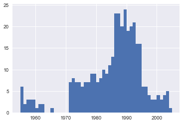
At a glance, we can see that the most invalid values in a single year is fewer than 25, and as there are 500 data points per year, removing these values would account for less than 4% of the data for the worst years. Indeed, other than a surge around the 90s, most years have fewer than half the missing values of the peak. For our purposes, let’s say this is acceptable and go ahead and remove these rows.
df = df.loc[~non_numberic_profits]df.profit = df.profit.apply(pd.to_numeric)
We should check that worked.
len(df)
25131
df.dtypes
year int64rank int64company objectrevenue float64profit float64dtype: object
Great! We have finished our data set setup.
If you were going to present your notebook as a report, you could get rid of the investigatory cells we created, which are included here as a demonstration of the flow of working with notebooks, and merge relevant cells (see the Advanced Functionality section below for more on this) to create a single data set setup cell. This would mean that if we ever mess up our data set elsewhere, we can just rerun the setup cell to restore it.
Next, we can get to addressing the question at hand by plotting the average profit by year. We might as well plot the revenue as well, so first we can define some variables and a method to reduce our code.
group_by_year = df.loc[:, ['year', 'revenue', 'profit']].groupby('year')avgs = group_by_year.mean()x = avgs.indexy1 = avgs.profitdef plot(x, y, ax, title, y_label):ax.set_title(title)ax.set_ylabel(y_label)ax.plot(x, y)ax.margins(x=0, y=0)
Now let’s plot!
fig, ax = plt.subplots()plot(x, y1, ax, 'Increase in mean Fortune 500 company profits from 1955 to 2005', 'Profit (millions)')
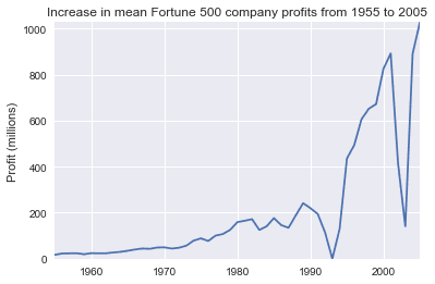
Wow, that looks like an exponential, but it’s got some huge dips. They must correspond to the early 1990s recession and the dot-com bubble. It’s pretty interesting to see that in the data. But how come profits recovered to even higher levels post each recession?
Maybe the revenues can tell us more.
y2 = avgs.revenuefig, ax = plt.subplots()plot(x, y2, ax, 'Increase in mean Fortune 500 company revenues from 1955 to 2005', 'Revenue (millions)')
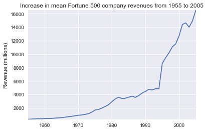
That adds another side to the story. Revenues were no way nearly as badly hit, that’s some great accounting work from the finance departments.
With a little help from Stack Overflow, we can superimpose these plots with +/- their standard deviations.
def plot_with_std(x, y, stds, ax, title, y_label):ax.fill_between(x, y - stds, y + stds, alpha=0.2)plot(x, y, ax, title, y_label)fig, (ax1, ax2) = plt.subplots(ncols=2)title = 'Increase in mean and std Fortune 500 company %s from 1955 to 2005'stds1 = group_by_year.std().profit.valuesstds2 = group_by_year.std().revenue.valuesplot_with_std(x, y1.values, stds1, ax1, title % 'profits', 'Profit (millions)')plot_with_std(x, y2.values, stds2, ax2, title % 'revenues', 'Revenue (millions)')fig.set_size_inches(14, 4)fig.tight_layout()
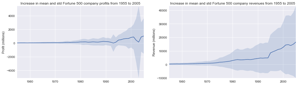
That’s staggering, the standard deviations are huge. Some Fortune 500 companies make billions while others lose billions, and the risk has increased along with rising profits over the years. Perhaps some companies perform better than others; are the profits of the top 10% more or less volatile than the bottom 10%?
There are plenty of questions that we could look into next, and it’s easy to see how the flow of working in a notebook matches one’s own thought process, so now it’s time to draw this example to a close. This flow helped us to easily investigate our data set in one place without context switching between applications, and our work is immediately sharable and reproducible. If we wished to create a more concise report for a particular audience, we could quickly refactor our work by merging cells and removing intermediary code.